MODELING DETAILS FOR CHESAPEAKE & OHIO
C&O FREIGHT CAR SCHEMES
Lately I have been indexing C&O freight car paint schemes, as shown in Dave
Hickox's C&O Color Guide to Freight and Passenger Equipment, in various Car
Cyc's, and in other publications. I am beginning to make sense out of the
246 freight car shots I've found, but still have some questions, for the C&O
experts:
Prewar - first of all, in or before 1935, it appears C&O used a Roman
"Chesapeake and Ohio" without any logo/herald. This road name was centered
high on hoppers and gondolas, low on cabooses, and was stacked in 3 lines on
the right side of house cars. At this time, reporting marks were bar over
C&O over number over bar, all in a Roman font, as was all the data. When
did this scheme really replace the "US Safety Appliances" lettering circa
1919 which can be seen on a gondola in the 1940 Cyc, p225?
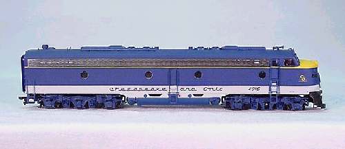
Circa 1947, C&O cabooses continued to be red with black roofs, but added the
first phase C&O for Progress herald, often centered between the windows.
This Phase I herald was distinguished by the wavy "smoky line" above
Progress, and the fact the "O" overlapped Progress a little. Circa 1948,
freight cars got the phase I "C&O for Progress" herald, usually used on the
right panel or right end of the side. It seems strange that cabooses got
the herald a year early, but the evidence points there.
Circa 1955, freight cars got the phase II Progress herald, with no wave in
the "smoke line" and a little space between the O and the word Progress
under it. Except for the logo, all other car lettering still looks like the
C&O version of railroad Roman. But in 1956, according to Dave on page 45
(Color Guide),hopper car lettering became Futura Demi Bold Gothic, and
yellow to boot. This FDBG is used both for the reporting marks (C&O over
number) and for (small)data markings.
Also in 1956, C&O cabooses were first painted yellow with blue FDBG
lettering. But then in 1957, C&O cabooses started getting a vermilion frame
stripe, and also got gray roofs that year (Color Guide p114). In 1957, it
appears gondolas, hoppers, and flats were black and got yellow frame stripes
for the first time. However, a C&O pig flat (later conveyed to Trailer
Train) delivered in 1959 did not have the yellow frame stripe (CG p 76).
I'm outright confused about whether the red/white Roman 1955 boxcar scheme
continued through the 1956-1961 period, or whether there were (also?) black
boxcars with yellow FDBG lettering and a yellow frame stripe. I have not
yet indexed any pictures that support the existence of such a black/yellow
scheme on boxcars.
In 1961, "specially equipped" or "specially assigned" boxcars appeared in
black with a white frame stripe, white FDBG lettering, and white phase II
"Progress" herald (CG p24). Again in 1961, it appears the standard paint
for hoppers, gondolas, and flats went to a similar black body with white
including white frame stripe. To confuse things, this same scheme appears
to have been on at least one covered hopper the year before in 1960
(CG p59).
Then in 1962, we see the white stripe omitted on black gondolas (Railroad
Car Journal Volume 5 Gondolas p26), on covered hoppers (CG p 61), and on
flats (CG p69). Also, by 1962 (should this be earlier?), non-equipped box
cars were painted red, with white FDBG lettering (CG p30). But the white
stripe on hopper cars seems to have continued until about 1965, when it was
dropped (CG p 43).
By 1966 (earlier ?), the vermilion frame stripe on cabooses was dropped,
simplifying the yellow paint scheme in the period when some woodsheathed
cabs were being resheathed in plywood. But then in 1968, new International
wide vision cabooses were delivered in blue with yellow lettering. Steel
caboose rebuilds (e.g. C-15C class) followed in 1968 through at least 1970
also using this blue/yellow 1968 scheme.
Note that this 1968 blue caboose scheme is a lot like a scheme used 1962-1972
on cars equipped with cushion underframes. This cushion car scheme
was distinguished by a blue body with yellow FDBG lettering but with
"Cushioned Underframe" in a uniquely squared yellow script. House cars with
this cushioned scheme had yellow doors 1962-1964, but blue or unpainted
aluminum doors after 1964. Also, a version of this same blue cushion car
scheme was used in the same period on cushioned coil cars. Additionally,
there were RBLs in this period with the colors reversed, with yellow bodies
and blue FDBG lettering/blue doors, carrying "Insulated Cushioned
Underframe" in blue script.
Presumably, repaints into Chessie's cracked plate started in 1973, but
that's another subject.
On an allied note, it appears many of the above phases appeared also on B&O
equipment, at least after about 1962. I can neither confirm nor deny that
the B&O changes happened at the same time as on the C&O, but the appearance
of C&O's Futura Demi Bold Gothic on B&O freight stock is unmistakable.
I'm betting someone else has done this before, only better. Can anybody
help me?
Rick Tipton
05/31/01
Enchantment Blue and Federal Yellow
1957 LCL Service Cars Only
Body was Enchantment Blue upper two-thirds (including roof) and
Federal Yellow lower third
Lettering and markings: Contrasting Futura Demi-bold
Second gen C&O for Progress monogram
1959-1972 Cushion Underframe Cars Only
Body was Enchantment Blue with Federal Yellow lettering and
markings for non-insulated cars
Body was Federal yellow with Enchantment Blue lettering and
markings for insulated cars
C&O Freight Cars Script "Cushion Underframe"
Galvanized roof
Freight Car Red Cars
1963 -1972 end-of-car cushion or non-cushioned cars
Body is almost Tuscan Red, ends might be black on some
White Futura Demi-bold lettering and markings
Galvanized roofs on newer cars
Freight Car Black Cars
1956-1958 new cars
Body was black
Lettering and markings were either white or Federal Yellow
Monogram was either C&O for Progress or C&O over Chesapeake &
Ohio on left side only
White sill visibility strip
Galv roof left unpainted
1959-1962 end-of-cushion and non-cushioned cars
Body: Reddish-brown with black ends
White lettering and markings
Second gen mono
1959-1962 end-of-car cushioned and non-cushioned with DF, SEl, & LQ
load restraining devices
Black body
White Futura Demi-bold lettering
White visiability strips on sills
Second gen mono
Galv roof if new
Regular box cars went Freight Car Brown (Reddish-brown by this PS-1
time) to black and back to Freight Car Brown (almost Tuscan Red)
Alfred Kresee
CHESAPEAKE & OHIO PASSENGER PAINT SCHEMES
According to Robert Henry (This Fascinating Railroad Business, 1942): "Time
was when many railroads had their own distinctive colors, such as the
varying yellows of the Chesapeake & Ohio . . ."
In the '31 Cyc., there was a heavyweight RPO, which had the roadname, with
ampersand, in an extended Roman, centered on the letter board.
According to the "Color Chart" in the Oct. '44 MR, all their passenger
equipment was olive green, including the sash, steps, trucks, and fronts of
the equipment boxes. The underframe and the rest of the equipment boxes were
black, as was the roof, hand holds, drip molding, and diaphragms. The
lettering was gold leaf, with imitation gold enamel (Dulux) on some.
According to a table in the Nov. 15, '47 RA, the streamlined train (Pere
Marquette) was delivered to the Pere Marquette in 1946, which Fritz Milhaupt
said then passed to the C&O with the PM merger in '47.
All the same, Milhaupt said, the paint scheme on the Pere Marquette
streamliner cars served as the prototype for the C&O's own giant order of
cars from Pullman Standard, delivered in 1950. The chief difference was that
the script lettering on the letterboard on the Pere Marquette streamliner
cars was plated steel, while on the C&O cars the script lettering was
painted in dark blue.
For what it's worth, IHC in the '94 Walthers catalog offered their
heavyweight cars in a blue, yellow, and gray scheme. In the '53 Cyc., a
Pullman corrugated steel car seemed to indicate this scheme, which I think
had a stainless steel corrugated panel, a blue window band and a yellow
letter board. The roadname was in script.
CDS has a set (no. 551) for C&O streamlined cars, said to be c. '53. The
roof, ends, window band and lettering were black, the letter board yellow,
the bottom below the belt rail was gray or stainless steel, the trucks and
underframe black. The herald, when used, was imitation gold and placed at
the end of the window band. The roadname was in script on the letter board.
(Milhaupt said this diagram - or my reading of it - was wrong in that the
window band was always the same blue as the PM cars, never black.
Milhaupt said there were two more schemes that the C&O used on their
streamlined cars, that of the stillborn Chessie, and the variant applied to
the Chessie cars when they were put into the general passenger pool. They
are less important, and may not even be worthy of mention here, but here
they are, nonetheless.
As delivered, these stainless steel fluted Budd cars had orange
letterboards, with the words "The Chessie" in the C&O's script in dark blue.
A "doughtnut" C&O herald (without the words "For Progress") was painted in
blue on the stainless steel next to the passenger door at the end of the
car.
When the Chessie train was canceled, these cars were reassigned to the
general pool. Several cars ran in Michigan for a while, and eventually all
but four were sold to other railroads. While in general service, they had a
yellow letterboard with dark blue lettering, and the "doughnut" herald next
to the door. These, and the later Budd RDCs, were the only all-stainless
cars on the C&O. The RDCs had stainless letterboards with blue Futura
lettering, and yellow stripes on the ends.
All of this information is supported by photographs and text in Chesapeake &
Ohio Streamliners: Second to None: by James Kemper Millard and in Chesapeake
& Ohio Color Guide to Freight and Passenger Cars by David Hickox.
Milhaupt pointed out that the irony of the blue and yellow paint on the PM
and C&O passenger equipment is that the PM (and later C&O) didn't actually
serve Ann Arbor, MI, yet adopted the colors of the University of Michigan.
This, despite the fact that the PM ran across the campus of Michigan State
University in East Lansing (whose colors were green and white).
© S.A. McCall